Appearance
Top App Bar Components
Overview
This library provides two separate Top App Bar components:
Top App Bar – The standard app bar, which can include a title, start icons, action buttons, and more. It supports different sizes and scroll-based background color changes. Center Aligned Top App Bar – A variant of the app bar where the title is centered, with optional start and end icons.
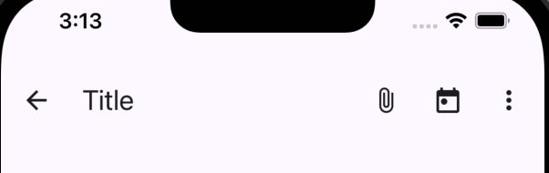
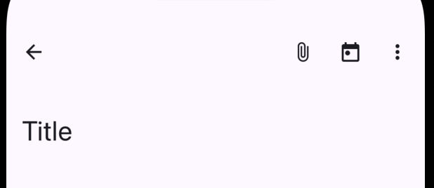
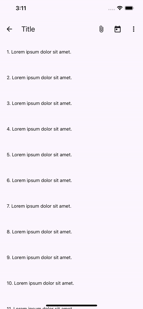
Top App Bar
The Top App Bar in its standard form includes a customizable title, start and end icons, and an optional action button list. This variant supports three different sizes (small, medium, large) and is ideal for more complex navigation schemes.
- Small Top App Bar
- Medium Top App Bar
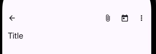
- Large Top App Bar
- Top App Bar with on scroll animation
Properties
| name | description | type | default |
|---|---|---|---|
| title | Required. Title text to display in the app bar | string | - |
| size | Size of the top app bar: SMALL, MEDIUM, LARGE | TopAppBarSize | - |
| StartIcon | Custom start icon (e.g., back button, menu) | React.FC | - |
| actions | List of action buttons to display | IconButtonProps[] | - |
| scrollStatus | 1 if scrolled down (background color changes); 0 if top is reached | SharedValue(number) | - |
| iconProps | Additional props for icons | T | - |
| titleStyle | Style for the title text | TextStyle | - |
| defaultColor | Color of the top app bar when at the top (unscrolled) | ColorValue | - |
| scrolledColor | Color of the top app bar when scrolled | ColorValue | - |
| animationDuration | Duration for the background color animation when scrollin | number | 300 |
Component Usage
typescript
import React from 'react';
import { Animated, NativeSyntheticEvent, NativeScrollEvent } from 'react-native';
import { useSharedValue } from 'react-native-reanimated';
import { TopAppBar } from '@computools/react-native-material-components';
export const MyComponent: React.FC = () => {
const scrollStatus = useSharedValue(0);
const onScroll = (e: NativeSyntheticEvent<NativeScrollEvent>) => {
if (e.nativeEvent.contentOffset.y > 10) { // 10 is the offset threshold when the top app bar changes background color
scrollStatus.value = 1;
} else if (e.nativeEvent.contentOffset.y <= 10) {
scrollStatus.value = 0;
}
};
return (
<>
<Animated.ScrollView onScroll={onScroll}>
{/* Scrollview content */}
</Animated.ScrollView>
<TopAppBar scrollStatus={scrollStatus} />
</>
);
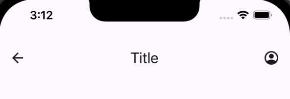
};Center Aligned Top App Bar
The Center Aligned Top App Bar component centers the title within the app bar. It can optionally include start and end icons. This is suitable for layouts where the title is the primary focus, and the icons are secondary.
Properties
| name | description | type | default |
|---|---|---|---|
| title | Required. Title text to display in the center of the app bar | string | - |
| StartIcon | Optional custom start icon (e.g., back button, menu) | React.FC | - |
| EndIcon | Optional custom end icon (e.g., settings, profile) | React.FC | - |
| scrollStatus | 1 if scrolled down (background color changes); 0 if top is reached | SharedValue(number) | - |
| iconProps | Additional props for icons | T | - |
| titleStyle | Style for the title text | TextStyle | - |
| defaultColor | Color of the app bar when at the top (unscrolled) | ColorValue | - |
| scrolledColor | Color of the app bar when scrolled down | ColorValue | - |
| animationDuration | Duration for background color change animation | number | 300 |
Component Usage
typescript
import React from 'react';
import { Animated, NativeSyntheticEvent, NativeScrollEvent } from 'react-native';
import { useSharedValue } from 'react-native-reanimated';
import { CenterAlignedTopAppBar } from '@computools/react-native-material-components';

export const MyComponent: React.FC = () => {
  const scrollStatus = useSharedValue(0);

  const onScroll = (e: NativeSyntheticEvent<NativeScrollEvent>) => {
    if (e.nativeEvent.contentOffset.y > 10) {
      scrollStatus.value = 1;
    } else if (e.nativeEvent.contentOffset.y <= 10) {
      scrollStatus.value = 0;
    }
  };

  return (
    <>
      <Animated.ScrollView onScroll={onScroll}>
        {/* Scrollview content */}
      </Animated.ScrollView>
      <CenterAlignedTopAppBar scrollStatus={scrollStatus} />
    </>
  );
};