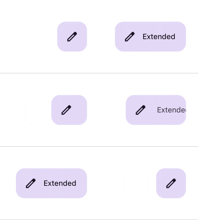
Appearance
Floating Action Button (FAB)
Overview
FAB provides a primary action in your application and can be customized with animation and size options.

Properties
| name | description | type | default |
|---|---|---|---|
| type | The type of FAB. Options: PRIMARY, SECONDARY, TERTIARY, SURFACE. | FloatingActionButtonType | PRIMARY |
| label | Text label for the FAB. | string | - |
| extended | Controls label visibility with animation. | true | - |
| size | Size of the FAB. Options: SMALL, BIG. | FloatingActionButtonSize | SMALL |
| iconProps | Additional props for the icon. | T | - |
| Icon | Icon to display in the FAB. | React.FC | - |
| labelStyle | Style for the label text. | TextStyle | - |