Appearance
Segmented Button
Overview
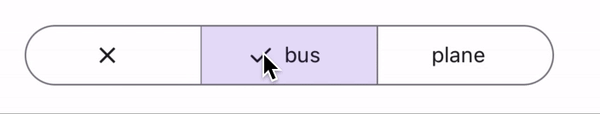
Segmented buttons allow users to toggle between multiple related options.
Properties
| name | description | type | default |
|---|---|---|---|
| segments | Required. The segments to display. | ButtonSegment[] | - |
| selected | Required. Selected segment(s). | T[] | - |
| onSegmentPress | Required. Callback when a segment is pressed. | (value: T[] | ((currValues: T[]) => T[])) => void |
| disabled | Whether the segmented button is disabled. | boolean | false |
| multiSelectionEnabled | Whether multiple segments can be selected. | boolean | false |
| withCheckmark | Controls checkmark visibility in the selected segment. | boolean | true |
| iconSize | Size of the segment icons in pixels. | number | 18 |
| iconColor | Color of the segment icons. | ColorValue | - |
| rippleColor | Ripple effect color on segment press. | ColorValue | - |
| labelStyle | Style for the segment labels. | TextStyle | - |
Button Segment
The Button Segment interface defines the structure of each segment in the segmented button.
typescript
export interface ButtonSegment<T, U> {
  value: T; // The value associated with the segment.
  label?: string; // Optional text label for the segment.
  Icon?: React.FC<U>; // Optional icon to display in the segment.
}