Appearance
Badge
Overview
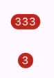
The Badge component is used to display concise information, such as a count, usually alongside another element like an icon or a button.
Properties
| name | description | type | default |
|---|---|---|---|
| value | Required. The content displayed inside the badge. Typically a string, such as a number or label. | string | - |
| valueStyle | Customizes the text style of the badge content. Accepts a TextStyle object. | TextStyle | - |