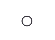
Appearance
Radio Button
Overview
Radio Buttons allow users to select a single option from a set.
Properties
| name | description | type | default |
|---|---|---|---|
| value | Required. The value associated with the button. | T | - |
| checked | Required. Indicates whether the button is selected. | boolean | - |
| onCheck | Required. Callback when the button is selected. | (value: T) => void | - |
| size | Size of the radio button. | number | 24 |
| labelEnd | Content displayed at the end of the label. | ReactNode | - |
| labelStart | Content displayed at the start of the label. | ReactNode | - |
| animationDuration | Duration of the selection animation. | number | 150 |
| indicatorStyle | Custom styles for the indicator. | ViewStyle | - |
| radioButtonStyle | Custom styles for the radio button. | ViewStyle | - |
| radioButtonColor | Color of the radio button. | ColorValue | - |
| checkedRadioButtonColor | Color when the radio button is selected. | ColorValue | - |