Appearance
Common Buttons
Overview
The Common Buttons include a variety of customizable button components to suit different use cases and design requirements. These components are styled to align with Material Design principles and support optional icons, custom text styles, and other features.
Button Components
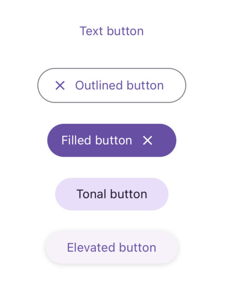
The library provides the following button components:
TextButton: A button used for less prominent actions.FilledButton: A button with a solid background used for primary actions.OutlinedButton: A button with a border outline used for secondary actions.ElevatedButton: A button with elevation used for actions requiring emphasis.TonalButton: A button with a soft tonal background.
Properties
| name | description | type | default |
|---|---|---|---|
| title | Required. The text displayed on the button. | string | - |
| StartIcon | A component displayed to the left of the title. | React.FC | - |
| EndIcon | A component displayed to the right of the title. | React.FC | - |
| iconProps | Props passed to the StartIcon and EndIcon. | T | - |
| titleStyle | Customizes the text style of the button title. | TextStyle | - |