Appearance
Sliders
Overview
The Slider component allows users to select a single value or range from a defined scale. It supports both continuous and discrete modes, as well as a centered mode for specific use cases.
This library provides two separate Sliders components:
Slider
The Slider component allows users to select a single value within a defined range. It can operate in both continuous mode or discrete mode (steps). A centered mode is also available, where the middle-point is aligned to the center of the track.
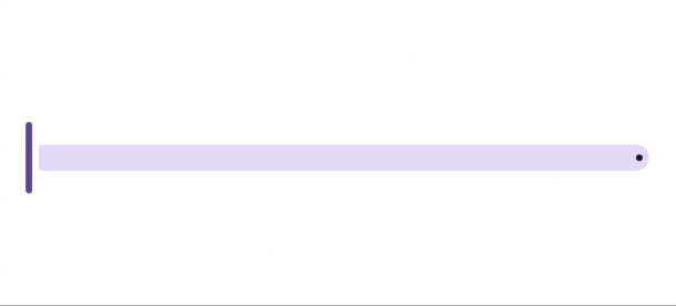
Continuous slider
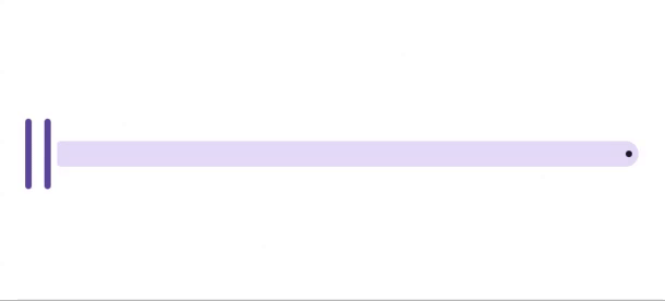
Centered slider

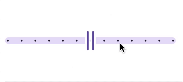
Discrete slider

Properties
| name | description | type | default |
|---|---|---|---|
| max | Required. The maximum value of the slider. | number | - |
| min | Required. The minimum value of the slider. | number | - |
| value | The current selected value of the slider. | number | 0 |
| step | If provided, the slider operates in discrete mode with steps of the specified value. | number | - |
| onChangeValue | Callback function triggered when the slider value changes. | (value: number) => void | - |
| disabled | Disables the slider when set to true. | boolean | false |
| centered | Enables centered mode, where the slider's zero-point is in the middle of the track. | number | boolean |
| damping | Controls the thumb animation's smoothness when a track point is pressed. | number | 20 |
| valueHeight | The height of the value indicator. | number | 44 |
| thumbWidthActive | The thickness of the thumb when active. | number | 2 |
| thumbWidthInactive | The thickness of the thumb when inactive. | number | 4 |
| thumbStyle | Custom styles for the thumb. | ViewStyle | - |
| valueStyle | Custom styles for the value indicator. | ViewStyle | - |
| indicatorStyle | Custom styles for the value indicator's container. | ViewStyle | - |
| trackPointStyle | Custom styles for individual track points in discrete mode. | ViewStyle | - |
| trackPointsStyle | Custom styles for all track points. | ViewStyle | - |
| filledTrackStyle | Custom styles for the filled portion of the track. | ViewStyle | - |
| remainingTrackStyle | Custom styles for the unfilled portion of the track. | ViewStyle | - |
Range Slider
The Range Slider component enables users to select a range of values within a defined scale. It consists of two thumbs that represent the minimum and maximum values. This component supports discrete and centered modes.
Discrete slider
Properties
| name | description | type | default |
|---|---|---|---|
| max | Required. The maximum value of the range slider. | number | - |
| min | Required. The minimum value of the range slider. | number | - |
| range | The current selected range (same as value). An array with exactly two elements: [min, max]. | number | - |
| step | Operates in discrete mode when a step value is provided. | number | - |
| onChangeValue | Callback function triggered when the range values change. | (value: number) => void | - |
| disabled | Disables the range slider when set to true. | boolean | false |
| centered | Enables centered mode, where the slider's zero-point is in the middle. | number | boolean |
| damping | Controls the smoothness of thumb animation when a track point is pressed. | number | 20 |
| valueHeight | The height of the value indicator. | number | 44 |
| thumbWidthActive | The thickness of the thumbs when active. | number | 2 |
| thumbWidthInactive | The thickness of the thumbs when inactive. | number | 4 |
| thumbStyle | Custom styles for the thumbs. | ViewStyle | - |
| valueStyle | Custom styles for the value indicator. | ViewStyle | - |
| indicatorStyle | Custom styles for the value indicator container. | ViewStyle | - |
| trackPointStyle | Custom styles for individual track points in discrete mode. | ViewStyle | - |
| trackPointsStyle | Custom styles for all track points. | ViewStyle | - |
| filledTrackStyle | Custom styles for the filled portion of the track. | ViewStyle | - |
| remainingTrackStyle | Custom styles for the unfilled portion of the track. | ViewStyle | - |