Appearance
Dialogs
Overview
Dialogs are interactive UI elements used to display critical information, request user input, or facilitate decision-making processes in your application. This library provides several dialog components, including:
Basic Dialog: A simple and flexible dialog with customizable actions.Full-Screen Dialog: A dialog that covers the entire screen, suitable for tasks requiring more space.Dialog: A wrapper component for creating custom dialogs with full control.
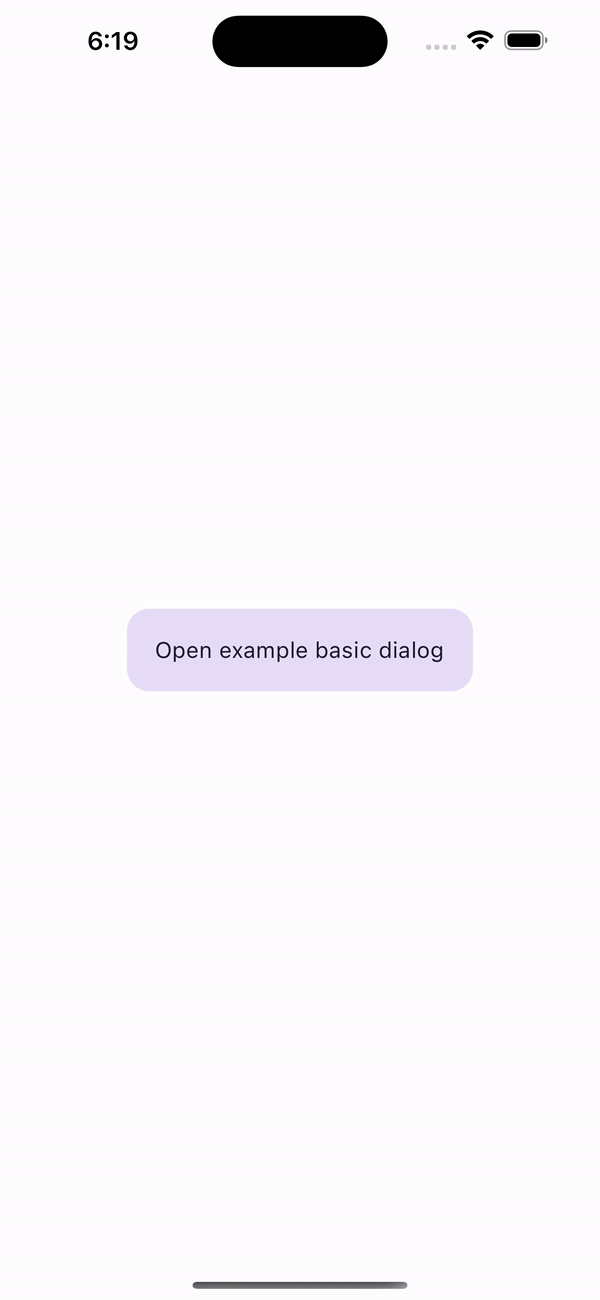
Basic Dialog
A ready-to-use dialog component that comes with common properties and functionality.
Properties
| name | description | type | default |
|---|---|---|---|
| title | Dialog title text | string | - |
| subtitle | Dialog subtitle text | string | - |
| firstActionTitle | Title of the first action button | string | - |
| secondActionTitle | Title of the second action button | string | - |
| onFirstActionPress | Callback for the first action button | () | () => void |
| onSecondActionPress | Callback for the second action button | () => void | - |
| titleStyle | Style for the title text | TextStyle | - |
| subtitleStyle | Style for the subtitle text | TextStyle | - |
| prepend | Component to prepend content | ReactNde | - |
| append | Component to append content | ReactNde | - |
Full-Screen Dialog
A dialog that occupies the full screen, ideal for tasks that require more space

Properties
| name | description | type | default |
|---|---|---|---|
| animationType | Type of animation: SLIDE, FADE or ZOOM | AnimationType | AnimationType.SLIDE |
| animationDuration | Animation duration (ms) | number | 330 |
Dialog
The Dialog component serves as a wrapper for creating custom dialogs. You can use it in conjunction with your own components to design a dialog tailored to your application's needs.
Methods
| name | description | parameters | returns |
|---|---|---|---|
| show | Displays the dialog. | none | void |
| close | Hides the dialog. | none | void |
| isShowed | Checks whether the dialog is currently visible on the screen. | none | boolean |
Properties
| name | description | type | default |
|---|---|---|---|
| animationDuration | Appearance/disappearance animation duration. | number | 220 |
Usage Example
typescript
import React, { useRef } from 'react';
import { Button } from 'react-native';
import { Dialog, type DialogRef } from '@computools/react-native-material-components';

export const YourComponent = () => {
  const dialogRef = useRef<DialogRef>(null);

  return (
    <>
      {/* Rest of your app code */}
      <Button title="Show Dialog" onPress={() => dialogRef.current?.show()} />
      <Dialog ref={dialogRef}>
        <YourDialogContent />
      </Dialog>
      {/* Rest of your app code */}
    </>
  );
};
Troubleshooting
- Modal Unexpectedly Reappears
In certain scenarios, a modal might reappear after being closed, particularly if actions such as navigation are triggered during or immediately after its closure. This behavior occurs due to race conditions in the UI thread.
Solution: Use InteractionManager.runAfterInteractions to delay actions until ongoing interactions are completed.
Fix Example
typescript
const onSubmitPress = async () => {
  const isSuccessfullySignedOut = await signOut();

  if (isSuccessfullySignedOut) {
    InteractionManager.runAfterInteractions(() => {
      navigation.dispatch(
        CommonActions.reset({
          index: 0,
          routes: [{ name: MainStackRoutes.Welcome }],
        })
      );
    });
  }
};