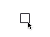
Appearance
Checkbox
Overview
Checkboxes allow users to select one or multiple options from a set.
Properties
| name | description | type | default |
|---|---|---|---|
| value | Required. The value associated with the checkbox. | T | - |
| checked | Required. Indicates whether the checkbox is checked. | boolean | - |
| onCheck | Required. Callback when the checkbox is checked. | (value: T) => void | - |
| labelEnd | Content displayed at the end of the label. | ReactNode | - |
| labelStart | Content displayed at the start of the label. | ReactNode | - |
| checkedIcon | Icon displayed when checked. | ReactNode | - |
| size | Size of the checkbox. | number | 28 |
| checkboxStyle | Custom styles for the checkbox. | ViewStyle | - |
| errorColor | Color of the error state. | ColorValue | - |
| borderColor | Border color when unchecked. | ColorValue | - |
| checkedBorderColor | Border color when checked. | ColorValue | - |
| checkedBackgroundColor | Background color when checked. | ColorValue | - |
| errorAnimationDuration | Duration of error animation in milliseconds. | number | 300 |