Appearance
Chips
Overview
Chips are compact components used for inputs, filters, and suggestions, allowing users to interact with or provide contextual information in a concise format.
This library provides follow Chips components:
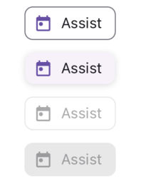
Assist Chip
Assist Chips are used for contextual actions and can include icons.
Properties
| name | description | type | default |
|---|---|---|---|
| label | Required. The text displayed on the chip. | string | - |
| elevated | Adds elevation effect. | boolean | false |
| LeadingIcon | Component for the leading icon. | React.FC | - |
| TrailingIcon | Component for the trailing icon. | React.FC | - |
| leadingIconType | COMMON, FAVICON or BRANDED | IconType | COMMON |
| trailingIconType | COMMON, FAVICON or BRANDED | IconType | COMMON |
| leadingIconProps | Props for the leading icon. | T | - |
| trailingIconProps | Props for the trailing icon. | T | - |
| iconSize | Size of the icon. | number | 18 |
| labelStyle | Custom styles for the label. | TextStyle | - |
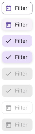
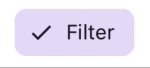
Filter Chip
Filter Chips are used to toggle filtering options and can display a loading state.
Properties
| name | description | type | default |
|---|---|---|---|
| label | Required. The text displayed on the chip. | string | - |
| selected | Indicates whether the chip is selected. | boolean | false |
| elevated | Adds elevation effect. | boolean | false |
| loading | Displays a loading indicator instead of the leading icon. | boolean | false |
| LeadingIcon | Component for the leading icon. | React.FC | - |
| TrailingIcon | Component for the trailing icon. | React.FC | - |
| leadingIconType | COMMON, FAVICON or BRANDED | IconType | COMMON |
| trailingIconType | COMMON, FAVICON or BRANDED | IconType | COMMON |
| leadingIconProps | Props for the leading icon. | T | - |
| trailingIconProps | Props for the trailing icon. | T | - |
| iconSize | Size of the icon. | number | 18 |
| labelStyle | Custom styles for the label. | TextStyle | - |
| activityIndicatorSize | Size of the loading indicator. | number | 38 |
Input Chip
Input Chips are used to represent user input and can display a leading image or default trailing icon.

Properties
| name | description | type | default |
|---|---|---|---|
| label | Required. The text displayed on the chip. | string | - |
| selected | Indicates whether the chip is selected. | boolean | false |
| elevated | URL for the leading image. | boolean | false |
| LeadingIcon | Component for the leading icon. | React.FC | - |
| TrailingIcon | Component for the trailing icon. | React.FC | - |
| leadingIconProps | Props for the leading icon. | T | - |
| trailingIconProps | Props for the trailing icon. | T | - |
| iconSize | Size of the icon. | number | 18 |
| labelStyle | Custom styles for the label. | TextStyle | - |
| hasDefaultTrailingIcon | Enables the default trailing Close Icon. | boolean | true |
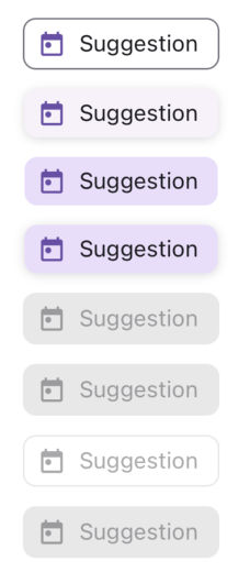
Suggestion Chip
Suggestion Chips are actionable suggestions for users and can include icons.
Properties
| name | description | type | default |
|---|---|---|---|
| label | Required. The text displayed on the chip. | string | - |
| selected | Indicates whether the chip is selected. | boolean | false |
| elevated | URL for the leading image. | boolean | false |
| LeadingIcon | Component for the leading icon. | React.FC | - |
| TrailingIcon | Component for the trailing icon. | React.FC | - |
| leadingIconProps | Props for the leading icon. | T | - |
| trailingIconProps | Props for the trailing icon. | T | - |
| iconSize | Size of the icon. | number | 18 |
| labelStyle | Custom styles for the label. | TextStyle | - |