Appearance
Text Inputs
Overview
Text Inputs allow users to enter text-based data, typically within forms. This library provides two types of text inputs: Filled and Outlined. Both types offer various features such as customizable icons, error handling, and styling options.
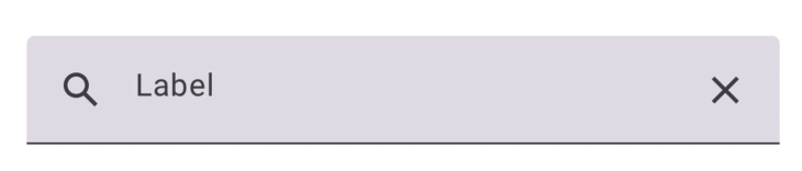
Filled Input
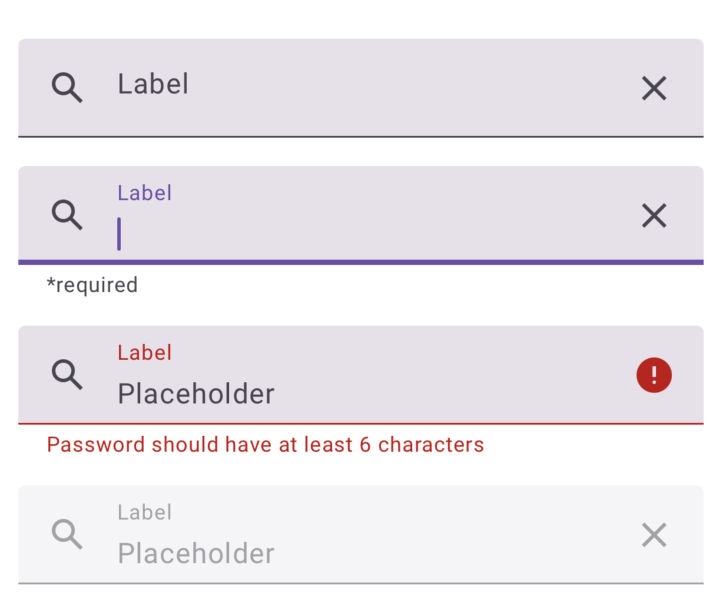
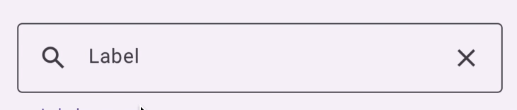
Outlined Input

Properties
Both Filled and Outlined inputs accept the following properties:
| name | description | type | default |
|---|---|---|---|
| label | Required. The label text displayed for the input. | string | - |
| disabled | Whether the input is disabled. | boolean | - |
| errorText | Error message to display when input is invalid. | string | - |
| suportingText | Text providing additional information or help. | string | - |
| leadingIcon | Component to render before the input field. | React.FC | - |
| trailingIcon | Component to render after the input field. | React.FC | - |
| leadingIconProps | Props for the leading icon component. | T | - |
| trailingIconProps | Props for the trailing icon component. | T | - |
| leadingComponent | Custom component rendered before the input. | ReactNode | - |
| trailingComponent | Custom component rendered after the input. | ReactNode | - |
| labelStyle | Custom style for the label text. | ViewStyle | - |
| supportingTextStyle | Custom style for the supporting text. | TextStyle | - |
| innerContainerStyle | Custom style for the inner container. | ViewStyle | - |
| outerContainerStyle | Custom style for the outer container. | ViewStyle | - |
| onOuterContainerLayout | Custom style for the active indicator (focus). | (e: LayoutChangeEvent) => void | - |
Additional Properties for Filled Input:
| name | description | type | default |
|---|---|---|---|
| activeIndicatorStyle | Custom style for the active indicator. | ViewStyle | - |
Additional Properties for Outlined Input:
| name | description | type | default |
|---|---|---|---|
| labelSlotStyle | Custom style for the label slot. If using a background color different from theme.surfaceContainer.backgroundLow, you will need to pass that color as the background for the label slot as well. | ViewStyle | - |