Appearance
Tabs
Overview
The Tabs components are a flexible navigation element for managing multiple screens or views. It supports animations, scrolling synchronization, badges, and customizable styles, making it adaptable to various UI requirements.
This library provides follow Tabs components:
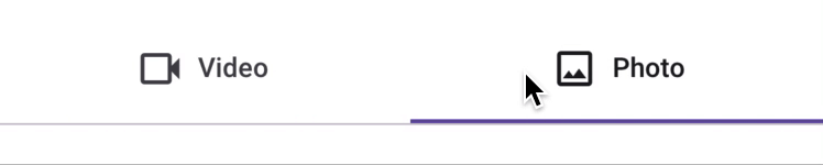
Primary Tabs: placed at the top of the content pane under a top app bar. They display the main content destinations.
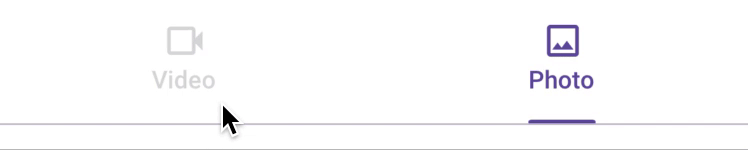
Secondary Tabs: used within a content area to further separate related content and establish hierarchy.

Properties
| name | description | type | default |
|---|---|---|---|
| tabs | Required. Array of Tab objects. | Tab[] | - |
| activeTab | State-managed active tab. Pass this prop to enable indicator animation when scrollAnim is not provided. | T | - |
| scrollAnim | Optional animation progress. Range: 0 to 1 / tabs.length. For scrolling responsiveness, see the Scroll Animation Integration section. | SharedValue(number) | - |
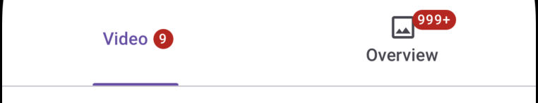
| badgeSize | Badge size: SMALL or BIG. | SMALL or BIG | BIG |
| animConfig | Optional configuration for tab animations. | (routeName: T) => void | - |
| tabIconProps | Optional properties for tab icons. | Y | - |
| tabStyle | Custom styles for individual tabs. V | ViewStyle | - |
| badgeStyle | Custom styles for badges. | ViewStyle | - |
| indicatorStyle | Custom styles for the indicator. | ViewStyle | - |
| tabsContainerStyle | Custom styles for the container holding all tabs. | ViewStyle | - |
| tabInnerContentStyle | Custom styles for the content within each tab. | ViewStyle | - |
| tabTitleStyle | Custom styles for tab titles. | TextStyle | - |
Tab Interface
Each Tabs component requires the tabs property, an array of Tab objects. The structure of a Tab is as follows:
typescript
export interface Tab<T, Y> extends Omit<TouchableOpacityProps, 'onPress'> {
  routeName: T;              // Unique identifier for the tab
  title?: string;            // Optional title of the tab
  icon?: React.FC<Y>;        // Optional icon component for the tab
  iconProps?: Y;             // Optional properties for the icon
  titleStyle?: TextStyle;    // Optional custom styles for the tab title
  onPress: (routeName: T) => void; // Function called when the tab is pressed
}
Scroll Animation Integration
To synchronize the tab indicator with scrolling behavior, manage the scrollAnim state in the parent component and pass it as a prop to the Tabs component.
typescript
import React from 'react';
import { Animated, useWindowDimensions, Text } from 'react-native';
import { useSharedValue, withTiming, interpolate, runOnJS } from 'react-native-reanimated';
import { Tab, SecondaryTabs } from './components';

const ParentComponent: React.FC = () => {
  const { width: windowWidth } = useWindowDimensions();
  const activeViewAnim = useSharedValue(0);
  const scrollViewRef = React.useRef<Animated.ScrollView>(null);

  const tabs: Tab[] = [
    { routeName: 'Screen1', title: 'Screen 1', onPress: () => handleScrollToScreen1() },
    { routeName: 'Screen2', title: 'Screen 2', onPress: () => handleScrollToScreen2() },
  ];

  const maxOutput = 1 / tabs.length;

  const handleScrollToScreen1 = () => {
    activeViewAnim.value = withTiming(0);
    scrollViewRef.current?.scrollTo({ x: 0 });
  };

  const handleScrollToScreen2 = () => {
    activeViewAnim.value = withTiming(maxOutput);
    scrollViewRef.current?.scrollToEnd();
  };

  const scrollHandler = useAnimatedScrollHandler({
    onScroll: (e) => {
      activeViewAnim.value = interpolate(e.contentOffset.x, [0, windowWidth], [0, maxOutput]);
    },
    onEndDrag: (e) => {
      if (e.contentOffset.x > maxOutput * windowWidth) {
        runOnJS(handleScrollToScreen2)();
      } else {
        runOnJS(handleScrollToScreen1)();
      }
    },
  });

  return (
    <>
      <SecondaryTabs scrollAnim={activeViewAnim} tabs={tabs} />
      <Animated.ScrollView
        horizontal
        ref={scrollViewRef}
        bounces={false}
        showsHorizontalScrollIndicator={false}
        onScroll={scrollHandler}
      >
        <Text style={{ width: windowWidth, paddingStart: 20 }}>Screen 1</Text>
        <Text style={{ width: windowWidth, paddingStart: 20 }}>Screen 2</Text>
      </Animated.ScrollView>
    </>
  );
};